User experience (commonly referred to as UX) transcends all marketing channels from SEO to PPC. It is a fundamental part of any digital marketing strategy as it is completely entwined with the user journey from site visitor to customer. In this article, we look at one of the tools we use here at SQ Digital to audit website UX.
Making Data-Driven UX Changes is a Must
If you need more insight when it comes to the marketing data you collect, there are plenty of options available. The Internet is awash with analytics tools designed to make it easier for you to work out precisely what your customers are doing – or, in some cases, not doing.
One very insightful tool, appropriately named Microsoft Clarity, helps marketers worldwide get a clearer idea of their position with user behaviour data. Let's take a closer look!
An Overview of Microsoft Clarity
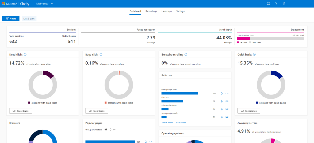
Launched in 2020, Clarity is a relatively new offering from Microsoft and is already proving useful for marketers and webmasters. It provides easy to understand data capture and analytics in a simple dashboard format. The tool contains several key features for a marketer to use; for example, session recording, which shows how users navigate pages on your website in reasonably granular detail.
This is a handy tool if you’re looking for more in-depth information on user behaviour throughout your website. Using screen recordings and heatmaps, you can see the most popular links on a page or what users are doing when they land on the page.
These heatmaps refer to the places where people clicked and scrolled when visiting your site, so you can more easily see what they’re doing. As for the sessions replays, you’re able to record how visitors are interacting with the pages.
The tool is GDPR-compliant, as you can also turn off the recording for places where sensitive information is gathered, like log-in pages.
Microsoft Clarity can be used alongside other tools, like Google Analytics, to give you a more detailed picture of how your site performs. For example, if a page isn’t converting, Microsoft Clarity can highlight further information and help you understand why.
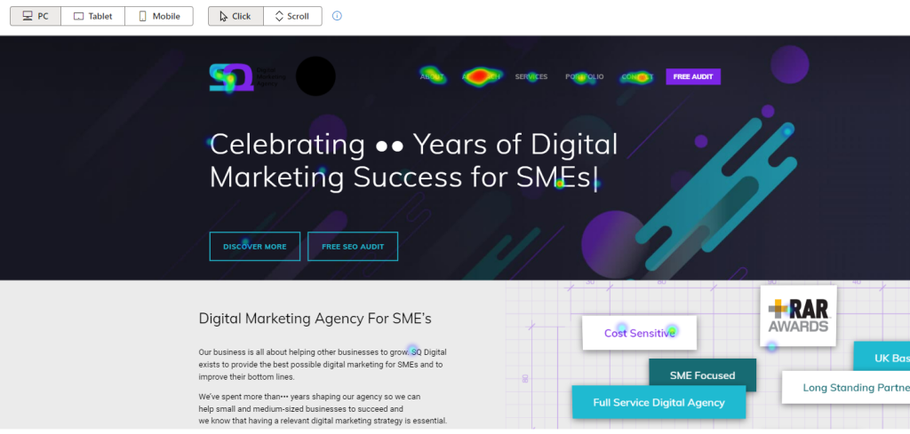
In the example below, certain elements of our homepage are highlighted through the heatmaps, showcasing where users are clicking most often. This helps us to see what draws their attention and the pages they’re interested in.
People are engaging heavily with the navigation bar, which is understandable because it’s where they can find the links to other pages on the site, including more information on the digital marketing services we provide.
Microsoft Clarity can also provide a wide range of simple data tools for businesses. It can, for example, organise the pages on your website in order of how popular they are – helping you to understand what content is most attractive to your visitors. It might not go as deep into the numbers as Google Analytics, but it does give you a good starting point for future investigation.
Clarity and Google Analytics: The Case for Using Both
Most PPC Agencies know that Google Analytics has long since been a big name in this field. It’s by far the most popular data analytics tool for digital marketers, and its association with the Google brand means that it’s likely to stay that way.
The general industry perspective on Microsoft Clarity is that it’s not – and probably never will be – a replacement for Google Analytics, as some of Google’s basic product features, such as bounce rates, don’t feature in Microsoft Clarity.
But rather than Clarity and Analytics competing with each other, we believe that the real benefit comes from using both platforms to build a complete picture of your site’s performance. Marketers who analyse and measure several factors simultaneously – such as several distinct campaigns at once or multiple conversion aims – can gather much more data than before, helping to better inform their decisions.
You can connect Clarity with Google Analytics by adding a link to Analytics sessions that helps you to identify areas where information is scarce. When you go back to Clarity, you’ll be able to see what visitors to your site saw and how they interacted with it.
To achieve this, Clarity creates a dimension called “Clarity Playback URL” that sends data to your Analytics account. Microsoft Clarity offers some metrics that Google Analytics doesn’t – or which Google Analytics doesn’t name in such a user-friendly way. This is why both Clarity and Analytics should be used together since they can complement each other well.
A marketer logging in to the Clarity dashboard will find, for example, ‘rage clicks’, a metric that works out how many website sessions featured negative user behaviour. The feature offers a simple way to investigate which pages of your website might be due for a redesign – and, unlike on the more complex Google Analytics, it can be done in seconds thanks to the centralised dashboard feature.
Both tools are free and simple to set up, requiring the addition of a script with tracking code to your website pages. As mentioned, Clarity provides actual recordings of visits, including where people place their cursor on a page and where they’re scrolling down to, which Analytics does not.
These are invaluable metrics if you want to improve your website, as well as the UX. For example, if users are leaving your site halfway down a page, you can figure out where the problem lies – it could be that the rest of the content on the page is not informative enough or that the layout is a little confusing.
This means you get the opportunity to look more critically at your site and analyse the users’ pain points. Why are they clicking on one link above another? Which pages are not performing as well as they should? How is the page rendering?
Clarity gives the answer to these and many more questions, so it’s fair to say it’s already a comprehensive tool despite being relatively new to the game. And it’s also clear that using just one of these tools could result in incomplete information – by combining Clarity with Analytics, you get access to more data than ever before!
Clarity: Simple or Complex?
But while we recommend using both analytics tools to get a more comprehensive view of your site’s performance, Microsoft Clarity is more straightforward to use than Google Analytics for those less confident with these types of tools.
And, given that the tools can integrate, investing time and effort in learning to use Clarity could give you more options, depending on the type of data you need and how quickly you need it. Clarity’s user-friendly dashboard is arranged so that the information required can be accessed and selected in just a few clicks, whereas Google Analytics might need more of a deep dive.
Ultimately, this goes to show that there’s no such thing as a perfect marketing analytics tool. A marketer with one set of conversion goals might need basic information, while a marketer with a different set of goals and requirements will need more sophisticated information.
Overall, Clarity is no better or worse than other tools on the market: it just caters to a particular need, and that need is simplicity and accessibility of information. Contact us today to find out how we can help your website reach its potential – or why not check how your website currently performs with our free SEO audit tool.


