8 Tips for Good User Experience (UX) on E-commerce Websites
In the UK alone, revenue from online retailers is growing significantly each year. In September 2021, a value of £1.99 billion was attributed to UK online retail sales – a huge value demonstrating the need for retailers to be present online. However, simply having a website isn’t enough anymore to increase customer reach; with growing demand, the competition is fiercer than ever.
The biggest hurdle for the success of an e-commerce website is user experience. If an e-commerce website design lacks a ‘good’ user experience, additional online marketing efforts are likely to fail. As digital marketing experts, we often identify the website as the limiting factor of potential marketing campaigns.
What is User Experience?
User experience is being used in the e-commerce industry more than ever and represents more than you might think. To define a user’s experience, we must consider their physical, auditory, and visual interaction with a website, in addition to their emotions, perceptions, psychological responses and the context of its use, as well as much more. And that is before, during and after their interaction with your website’s interface.
That sounds like a lot to consider, and it is! There’s no hiding the fact that when it comes to understanding people’s needs, there is no one size fits all approach, especially when different industries and audiences are thrown in the mix. Fortunately, there are some constants we can focus on to help provide a good user experience for retail websites. These centre around usability (how easily the customer interacts with the website interface) and understanding customer expectations.
Defining Present Day Customer Expectations
The customer expectations we refer to are the top-level needs that transcend product and industry. A report by Nielsen Normal Group (world leaders in research-based user experience) outlined convenience, speed, assurance, accuracy, options and experience as the main expectations for online e-commerce customers. You can start to see how these expectations are met when you look at the websites’ of the most successful UK online retailers.
Lessons from the best
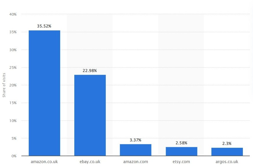
The UK leading online retailer for 2021 was Amazon. When you look at the website, you can see it meets present-day customer expectations very well through its usability. It’s worth pointing out that these large companies are successful due to well-thought-out business models that meet customer expectations in parallel with their websites. This includes in-store pickup, easy returns, downloadable apps etc., all of which require extensive and complex infrastructure, time and money. However, when it comes to their e-commerce websites’ there are many lessons to be learnt that are relevant to all online e-commerce businesses, from the very small to the very large.
8 Tips for Good E-commerce Websites:
1. Implement Fast Page Loading Speed with Good Page Experience
If you have fast-loading web pages it will stop people from leaving your website in frustration. Users expect immediate information and page loading. Unfortunately, the people who view your website may well have experienced other websites with faster page loading speeds. This previous experience will reduce patience and increase the necessity for you to also improve page speed. On top of that, there is increased focus, not just on speed but also on the loading experience. As SEO experts, we would refer to these elements as Core Web Vitals, but it simply means how smooth does the page load?
Think about buttons moving during the loading time and accidental clicks or images loading after you’ve started reading text, making you scroll back to where you were. These are all examples of bad usability and page experience.
2. Use Large Mega Menus
Mega menus are large menus organised in one view with categories and products shown together in logical groups. The below example from Asos shows an excellent example of a rectangular mega menu that allows the user to see all their options in a top-level category they are interested in.
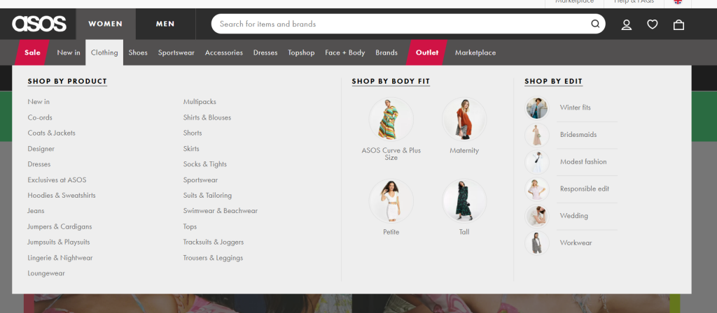
Mega menus are an excellent choice for e-commerce websites because they give the users the information about the largest number of options efficiently.
Important considerations are that the menu should never drop below the fold (that is no matter which screen size the user is on, they shouldn’t have to scroll). It’s also important to ensure that the mega menu appears no quicker than 0.5 seconds once hovered over. If the user is heading for the search bar but briefly passes their cursor over the main navigation, they don’t want a rapid succession of large menu dropdowns to interfere with their intentions.
3. Sophisticated Search Function
Using a search bar with excellent predictability, speed of suggestion, the forgiveness of spelling mistakes and other intelligent features is another must for an e-commerce website. Below you can see the search menu for Amazon. Even with one letter, the search function makes suggestions to show the best-matched options as the user types.
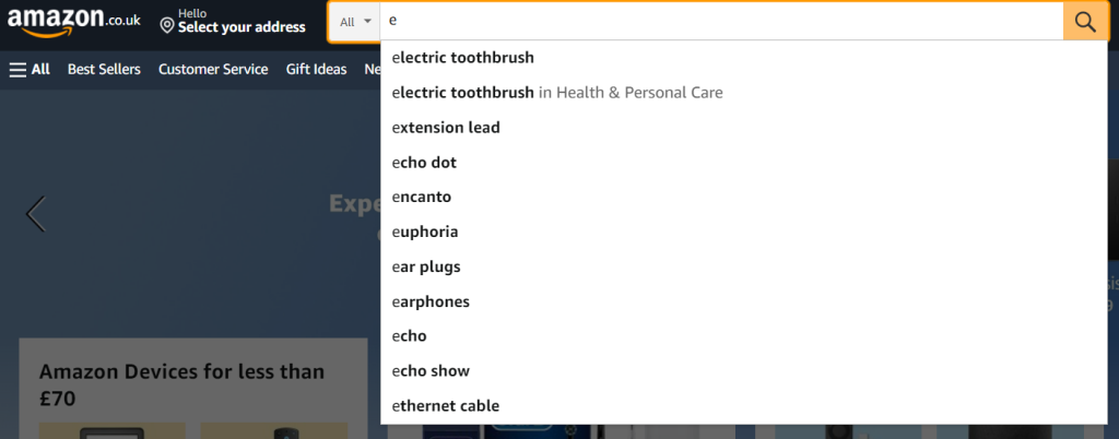
This speeds up the time from the user looking for the required product or category to finding it. Similar to the mega menu, it is important that the suggestions dropdown does not disappear below the bottom of the current screen for the user to avoid unnecessary scrolling.
4. Accurate In Stock and Delivery Information
Nothing will put your online customers off more than missing or inaccurate information. Finding out an item is unavailable after trying to purchase through the cart is a huge inconvenience and a waste of their time. The in-store equivalent would be a shop assistant asking a customer to wait 10 minutes while they retrieve the product for them, only for them to return after 10 minutes without it and not apologising (your website can’t soften the blow as a person can). The same goes for delivery details, which is why successful e-commerce websites encourage location detection before the user starts adding items to the cart. Argos.co.uk does this well, encouraging the user to select their preferred delivery time and store, in the case of in-store collection:
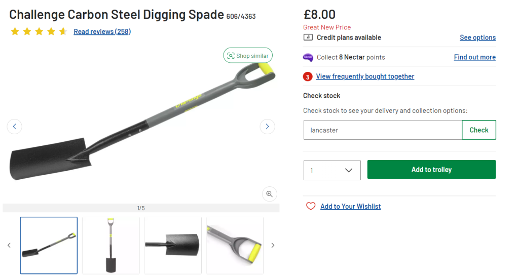
If you have any product detail errors, we would recommend you prioritise addressing them. The worst example of inaccurate information would be incorrect product dimensions or descriptions. There is no excuse for these kinds of errors, and it would be no surprise if an e-commerce business failed because of it.
5. Accessible & Responsive Design
Making sure your website is accessible to all users not only means you capture the largest possible audience, but it is an ethical must as well. It is essential you don’t exclude any users from being able to experience and interact with your website. This doesn’t just apply to people with sensory or physical impairments but also users on different devices, internet connections and so on. So on top of ensuring your website design is accessible, it must also be responsive under a wide range of conditions. Knowing if your website meets these requirements can be tricky but your website design and development team can give you this information.
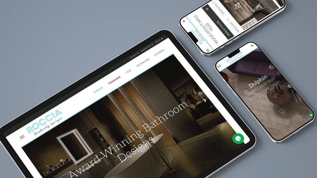
Our web design team created the responsive web design that you can see above for one of our retail clients, Roccia. Making sure your website works on all devices, for all users, is vital.
6. Have a Well-Though-Out Checkout Process
The checkout stage is crucial to get right because your website has already done all the leg work. Losing people at this stage is like running a marathon and then stopping before the line. On the flip side, it is the easiest stage to develop to see the most significant customer retention and sales improvements.
Offering sign-up options can help return customers speed up purchasing, and it can be used to increase your email marketing list. However, you should always provide guest check out options to cater to all audiences. The stage you present these options is also crucial. You can do this before the purchase stage or after, where sign-up at the end is optional (and the sign-in option is ever-present in the navigation). Both can work; however, the latter will reduce the purchase process by one step and can be preferred by customers.
In addition, if you use an external payment site, make sure you have wording on the page to explain what will happen to the user. They need to trust the website at every moment. Other tips for a well-thought-out checkout process include making the product details (especially price) visible at all times, so the user has no doubts about what they are buying, and ensuring any errors in filling out fields are clearly displayed.
7. Good Quality Images
Use high-quality images to attract and engage your audience. Use them as a wow factor, with many different angles and zoom options. Show images with the item in use vs not in use etc. The product image is the only way the user can interact with an item before purchasing. Having a high-resolution photo that is flattering (you might need to consider improving how the images are taken in some cases) with a very detailed alternative description for those relying on auditory descriptions, is a must.

You can see the image and image carousel available at Banks Lyon above. There are images of the front and back of the watch and a third image that lets the customer see its packaging. The images also have a zoom function on hover, increasing the visible detail shown. It is essential to use high-quality images that don’t impede page load speed and experience.
8. Descriptive Content
There is a reason everyone says content is king in online marketing. Content is your narrative with the user, it is how you walk customers through your website, pointing them in the right direction. For an e-commerce website, its purpose is multifold. Product description information must be detailed and answer all of the user’s questions. Include things such as size, material, weight and functional metrics. For more technical products having downloadable data sheets and specifications are all very helpful. For online clothing retailers, the content should include size guidance (even if a link to a size guide on another page) and information on where items are produced. There is no such thing as too much information with a good layout and structure.
Identifying the Need to Improve Your E-commerce Website
Through website traffic monitoring tools, such as Google Analytics, you will see the volume of traffic coming to your website and whether the proportion who purchase is low. Identifying industry-relevant benchmarks, such as average checkout abandonment rates and conversion rates, and then cross-referencing with your own data, can help you know if something is wrong. Once you know there is something wrong, the hard part is working out the sticking points.
We use a user behaviour tracking tool called Microsoft Clarity and A/B testing to improve website user experience. If you need any help improving your e-commerce website, please don’t hesitate to get in touch with our web design experts. We are well versed in building WordPress websites designed with the end-user in mind.
